Anchor Staging Portal
Designing the next-generation staging portal (see Part 1 here)
Role: Product Designer
Scope: Research, user story mapping, UI design, usability study, dev handoff
Timeline: Q2 2023 - Q4 2024
Team: PM, engineers, business stakeholders
Tools: Figma, Mural
Problem:
In Wave Staging, containers are staged to general zones.
Part 1 (Wave Staging) told the story of replacing a deprecated portal for Division eCommerce Managers (DEMs) This project focuses on the same users but now, the challenge was to design for the next-generation staging system called Anchor Staging.
This new system unlocks:
Improved stage & de-stage efficiency
Permanent Container Label initiative ($8m in savings)
Detailed equipment configuration
The goal: Design a portal to accommodate the Anchor Staging system
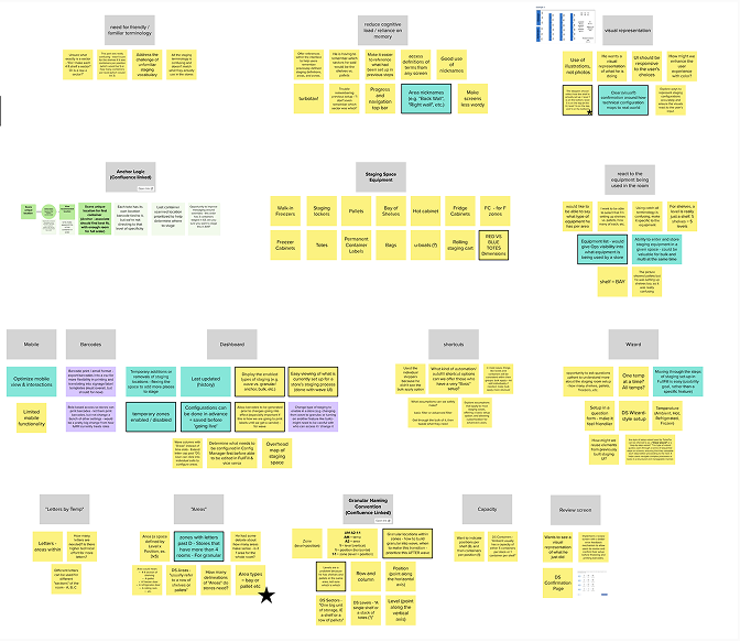
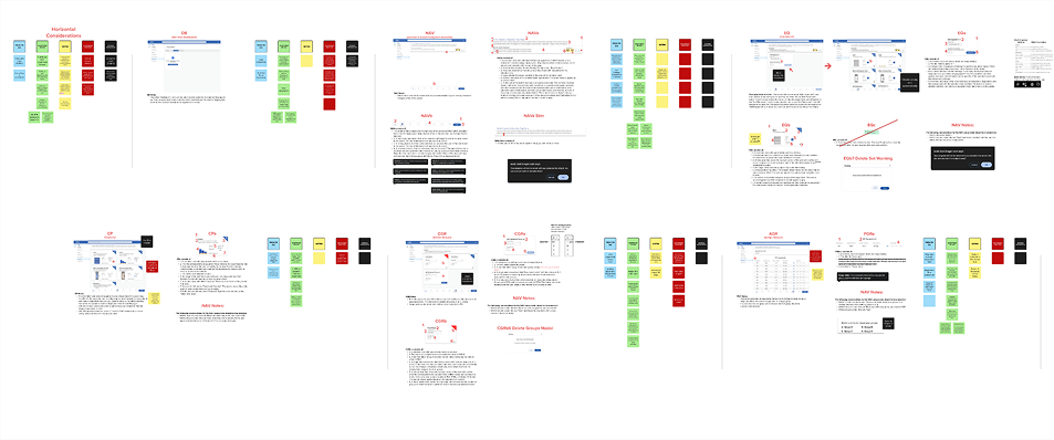
Affinity mapping of stickies from previous activities into insight groups
Story map of needed functionality
Design Goals:
Clarify Terminology: Define staging terms; show, don’t tell.
Visual Hierarchy: Highlight key info; use accurate image examples.
Simplify Interface: Provide common defaults; keep advanced options.
Guidance & Feedback: Add review step and clearer messaging before saving.
Research:
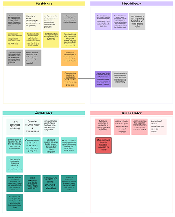
Requirements were prioritized by the team with MoSCoW (must have, should have, could have, won’t have)
We ran a heuristic evaluation to avoid past staging UI pitfalls.

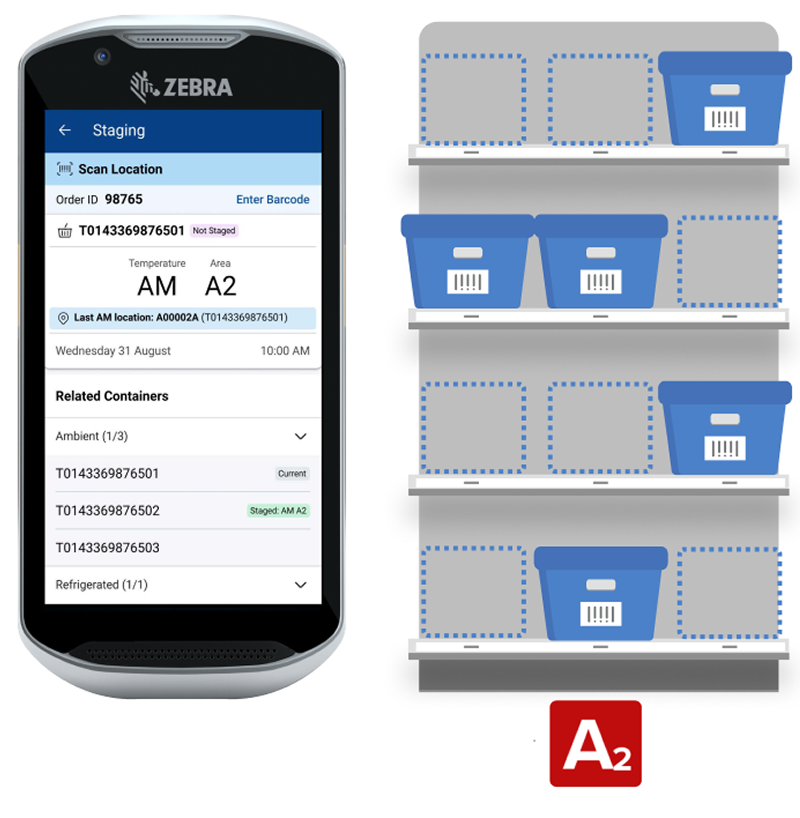
In the updated Anchor Staging system, containers are staged to precise locations.
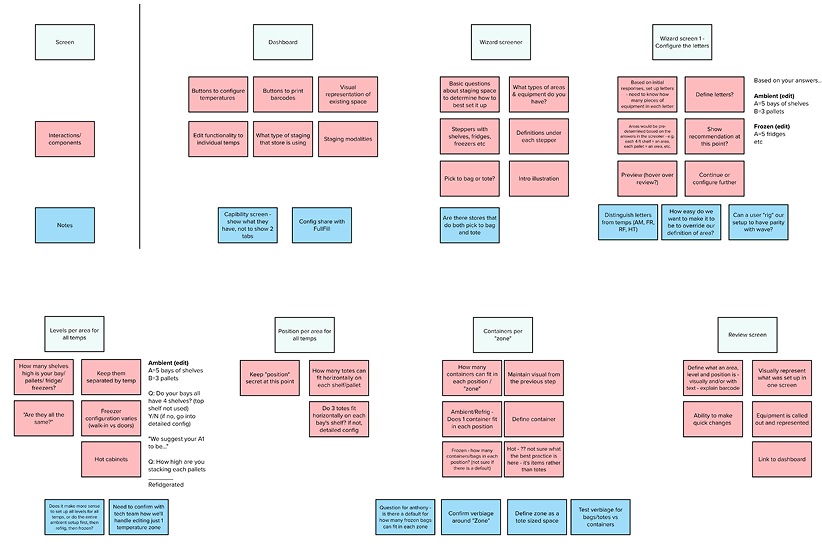
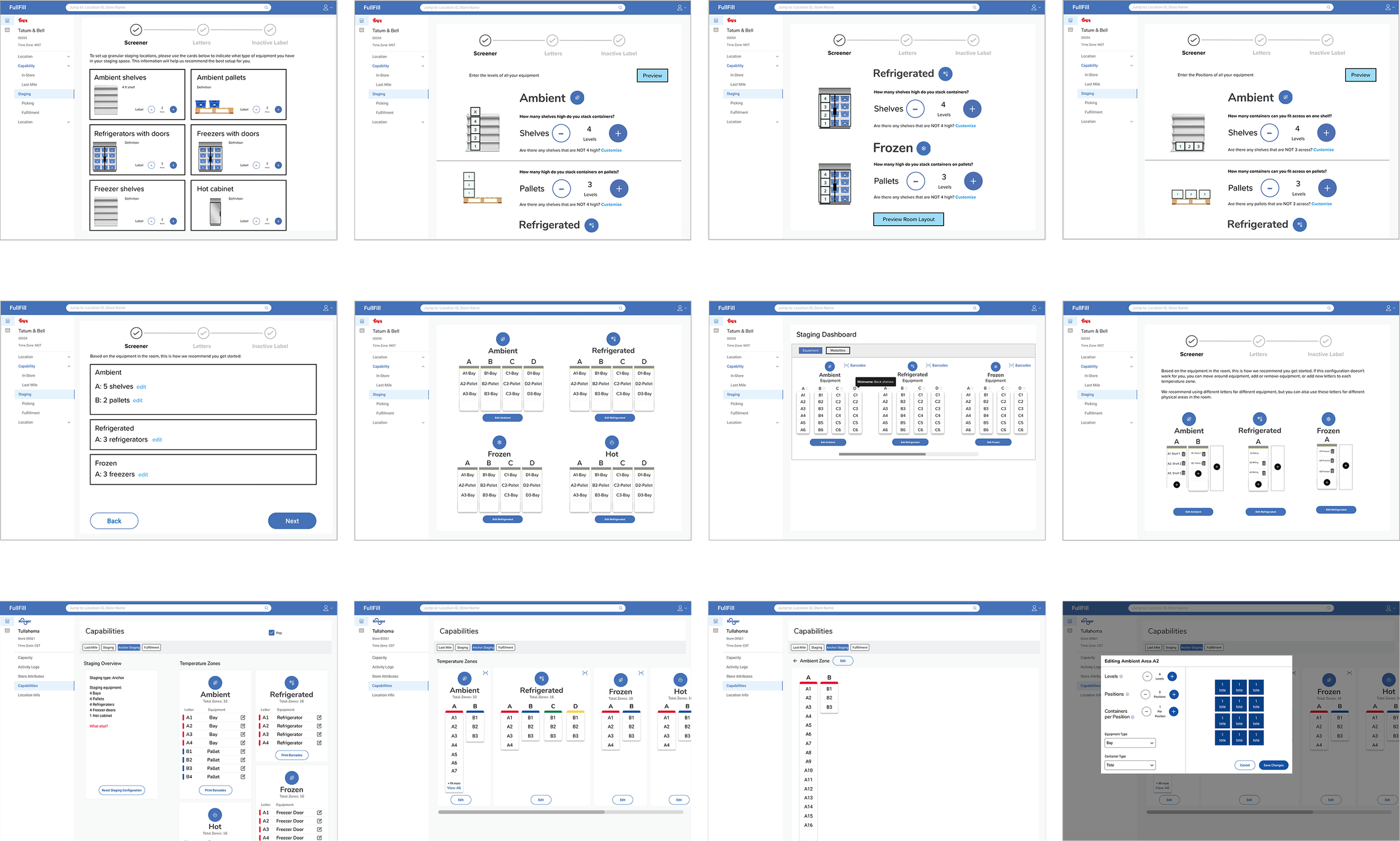
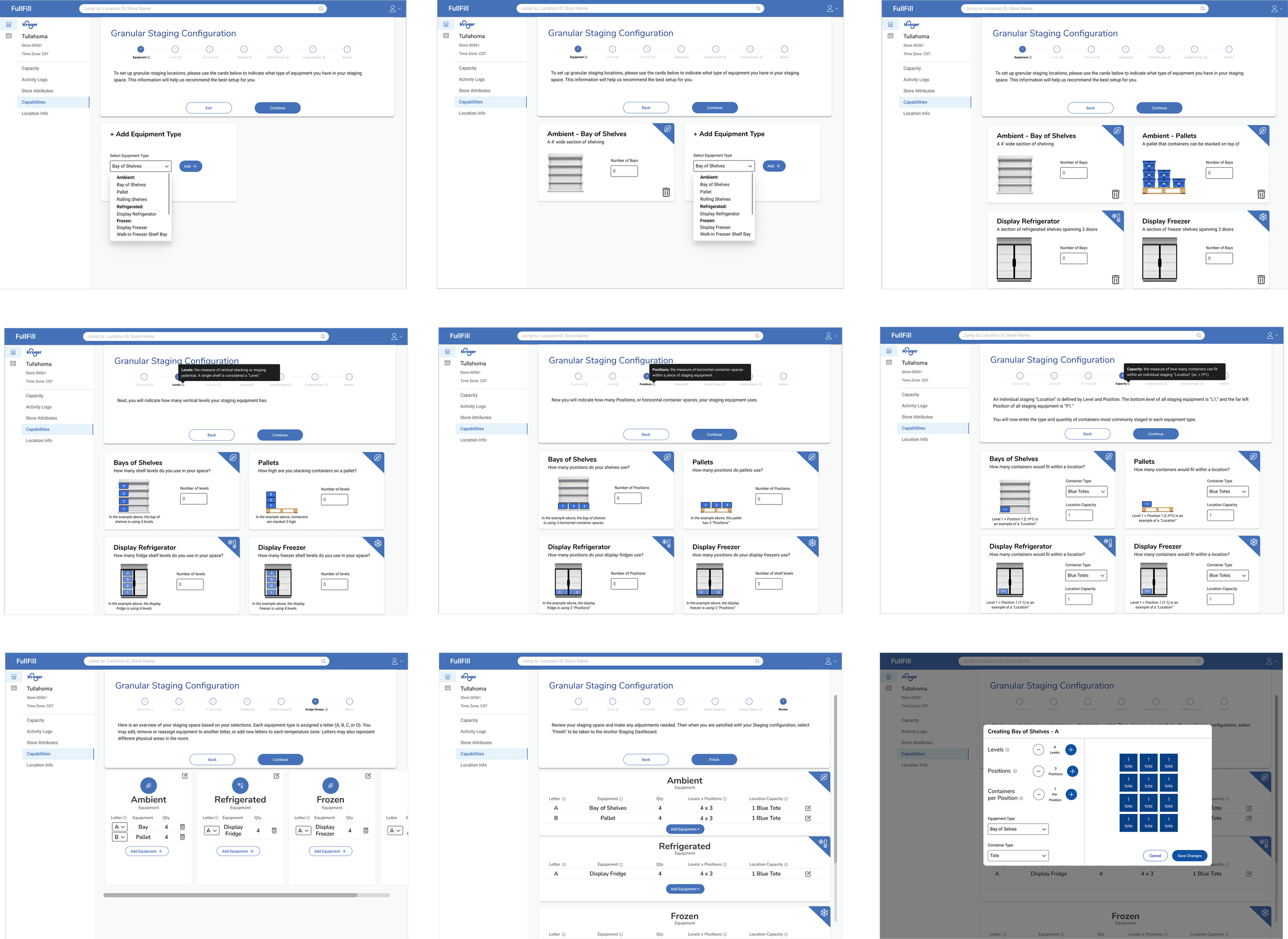
Hi-Fi Mockup - Key Features:
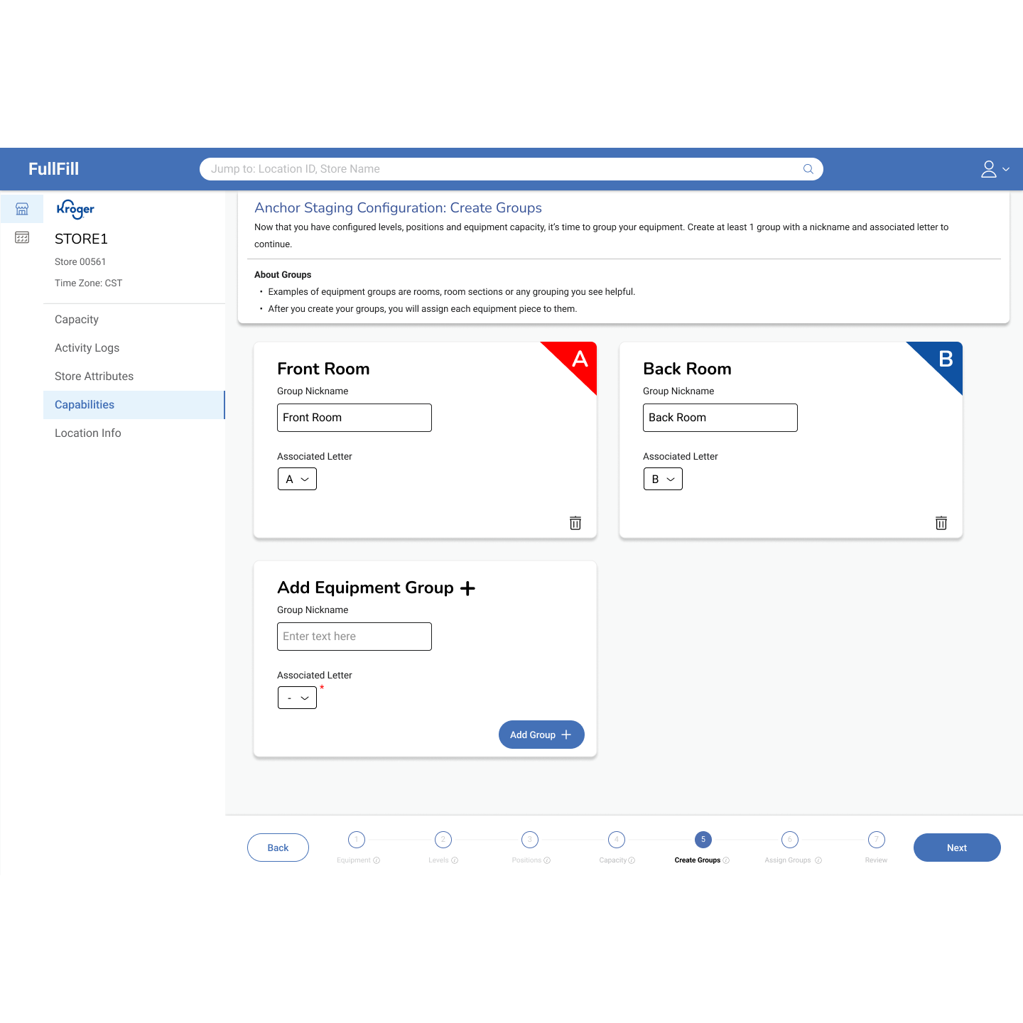
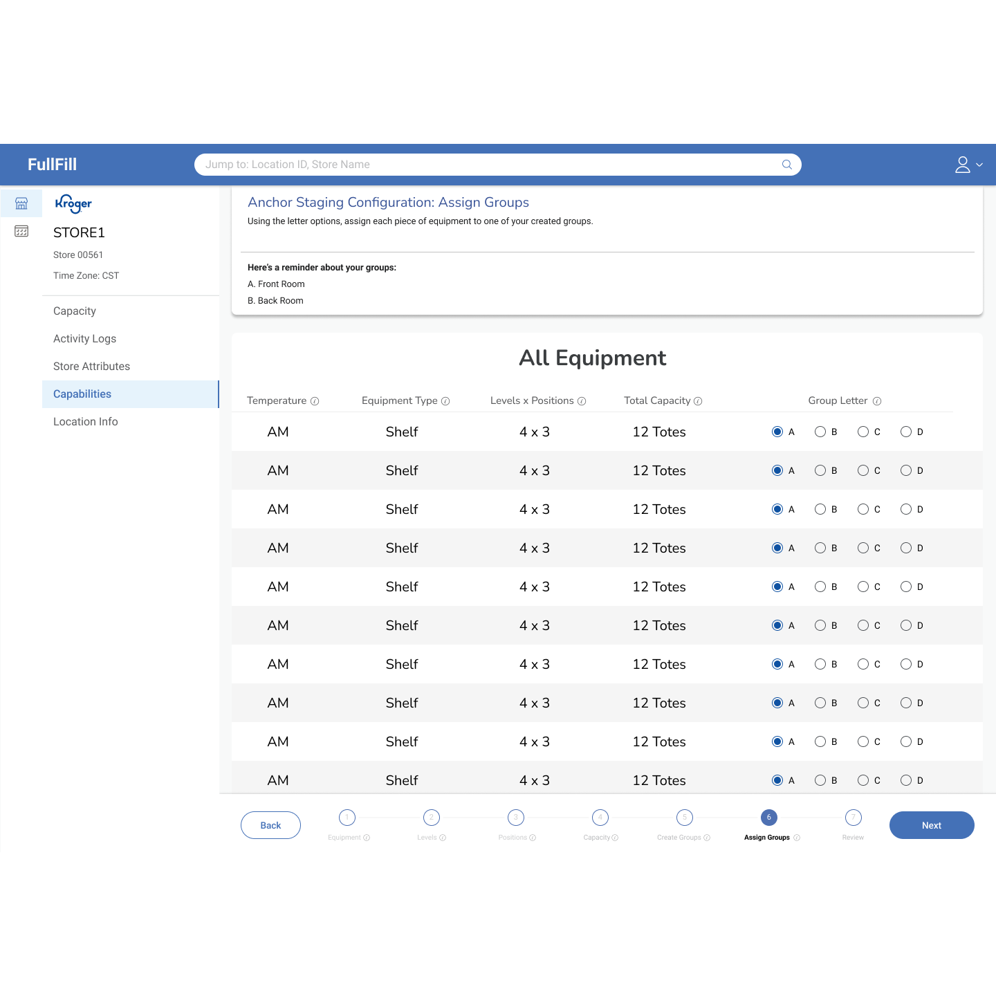
Because of the number of steps involved in establishing equipment aspects, we decided to use a wizard-type flow to prevent cognitive overload.
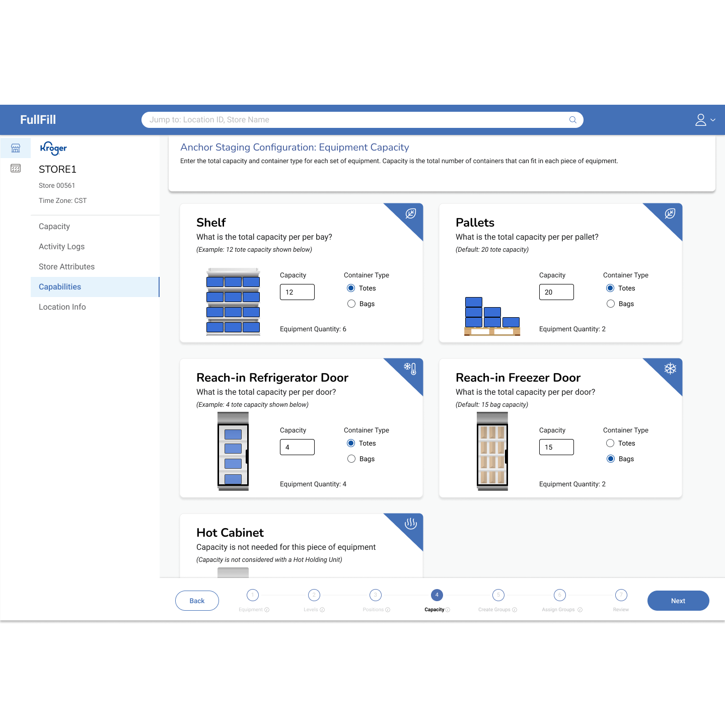
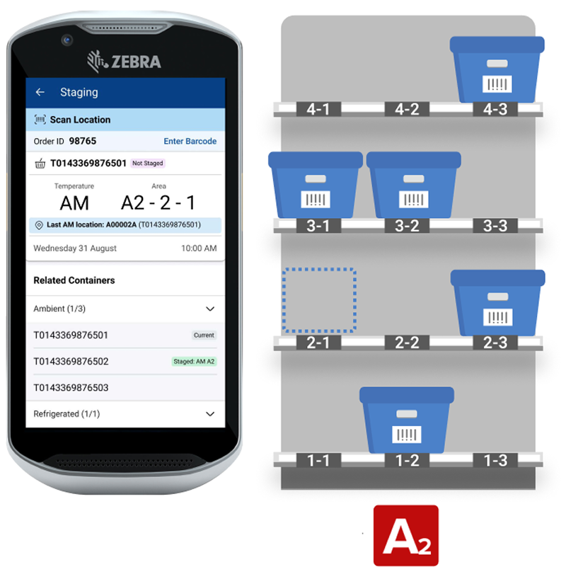
We included visual cues and informative tooltips about each “stack” of equipment, making sure users knew what they were configuring
We made sure to integrate and build on operational best practices to ensure product longevity. This included standardized equipment defaults and setting minimums & maximums.
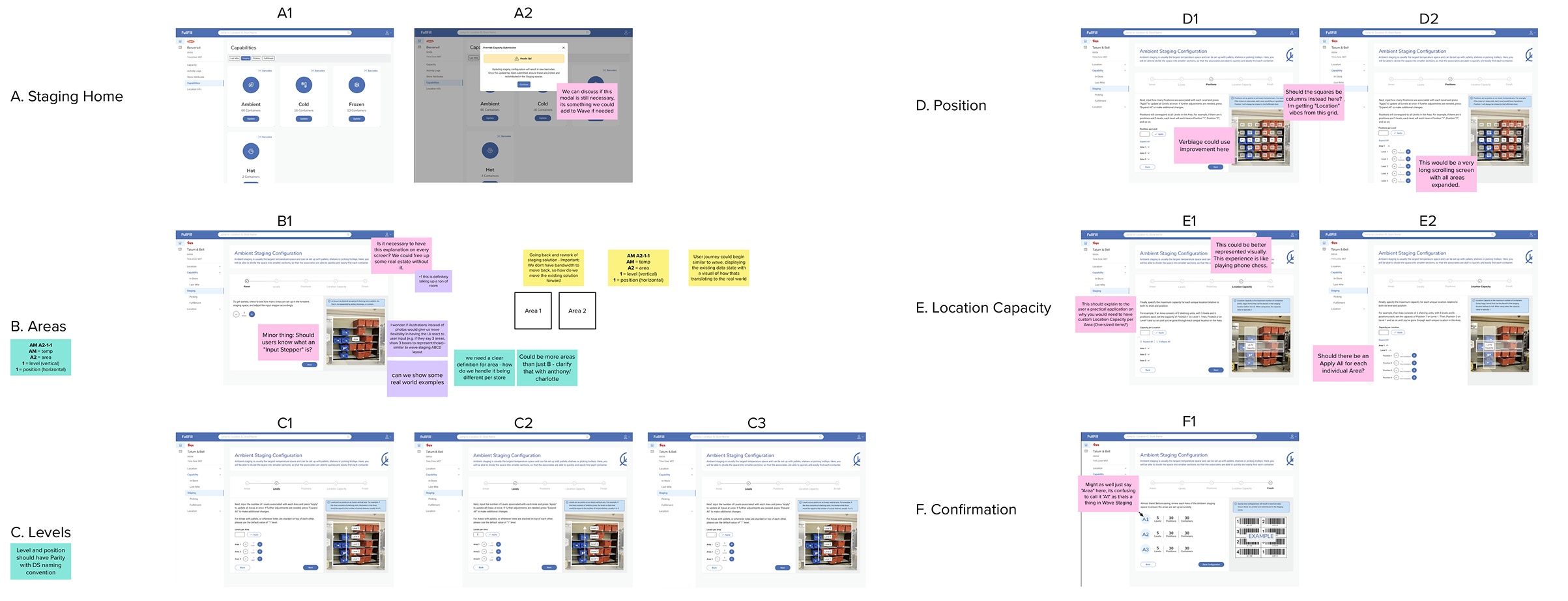
Design
A sticker sheet of common components was used to quickly generate many concepts. Then we refined and integrated the concepts to arrive at a design that takes all our goals into account.
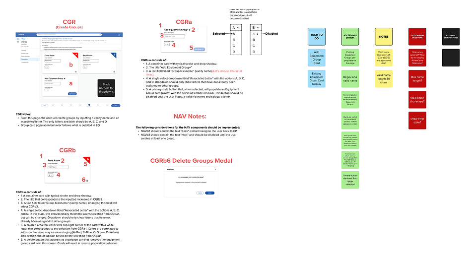
Dev Handoff
Because of the project’s complexity, we expanded our handoff process to document every detail of each component, ensuring clarity for development.
Launch to Enterprise
Anchor Staging UI was launched in Q2 2024 to 75+ DEM users and is currently used to edit configurations for 1000+ stores
Outcomes:
Enabled Permanent Container Labels initiative which saves the business $8m/yr
Captures more equipment details which enables greater eCommerce efficiency
Improved stage & de-stage time by a collective 13%
Retro:
This project was a step into greater autonomy as a designer at KTD. Coming off the success of designing the Wave Staging Portal, I was equipped with confidence and knowledge to make decisions that I felt best served the user, our business stakeholders and our development team. The scope of this project was much larger than it’s predecessor, and as a result took more regular communication with everyone involved to ensure success. My favorite part of this process was early design iteration and creating handoff documentation.
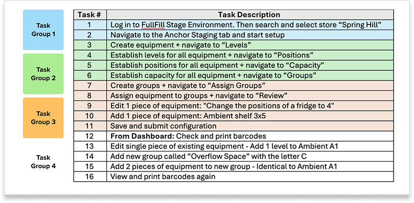
Usability Study
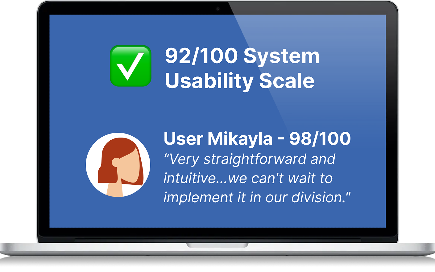
We prepped all 5 DEM users with a primer, then ran grouped tasks with follow-up questions while other teammates captured notes in Mural. Success was measured using the System Usability Scale (SUS) and from out study we achieved a rating of 92/100. No major design changes were needed based on our findings.
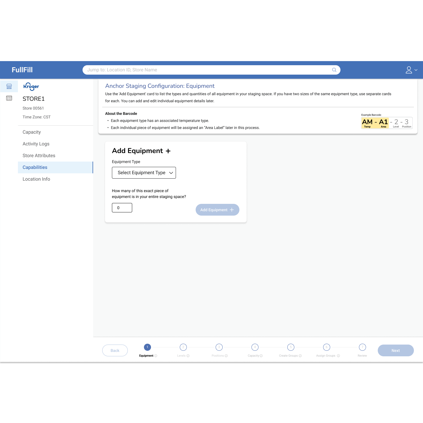
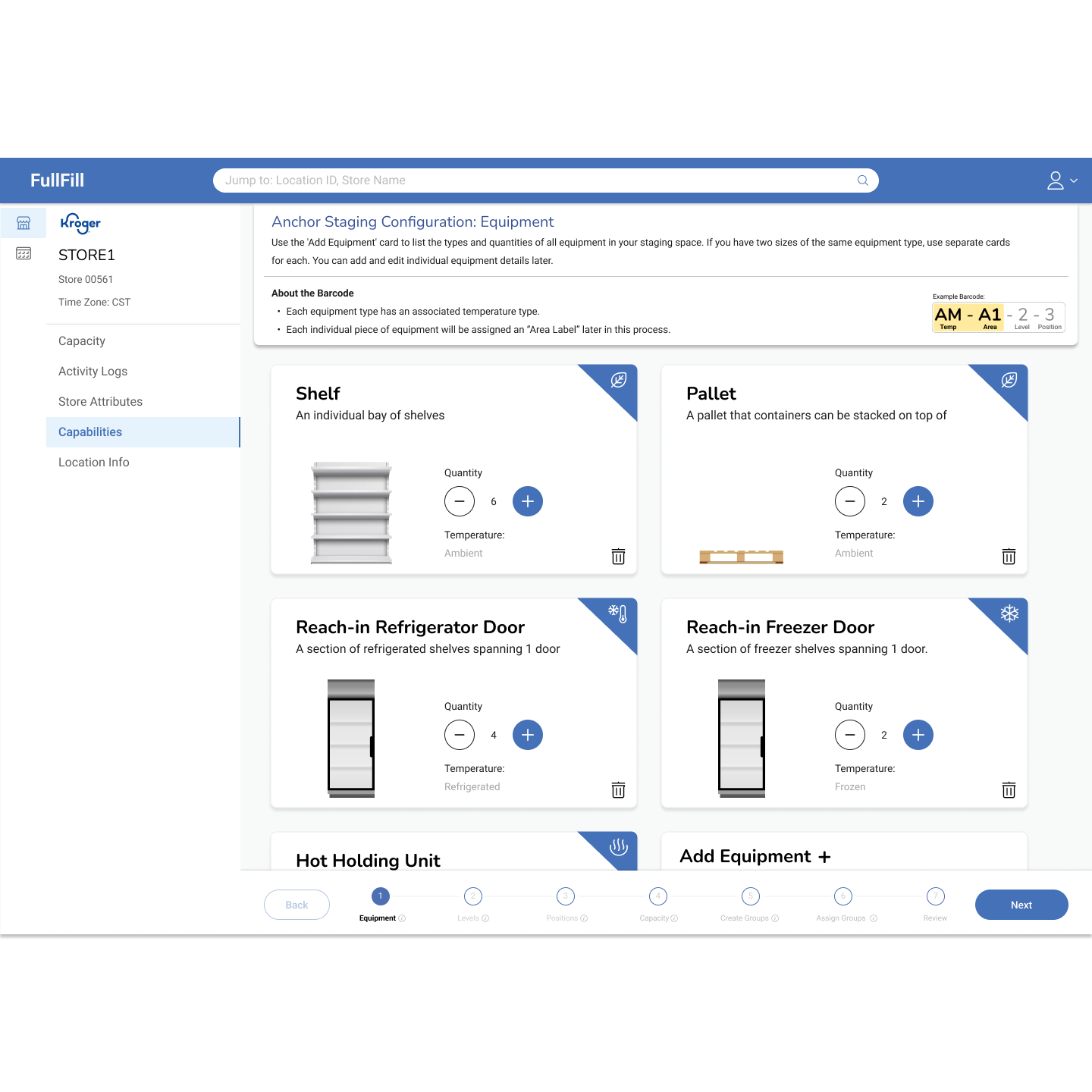
Anchor Staging Gallery
-
![]()
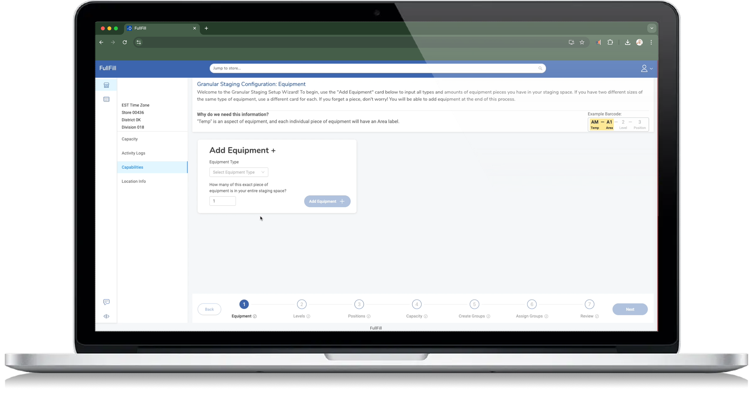
Step 1: Add Equipment
-
![]()
-
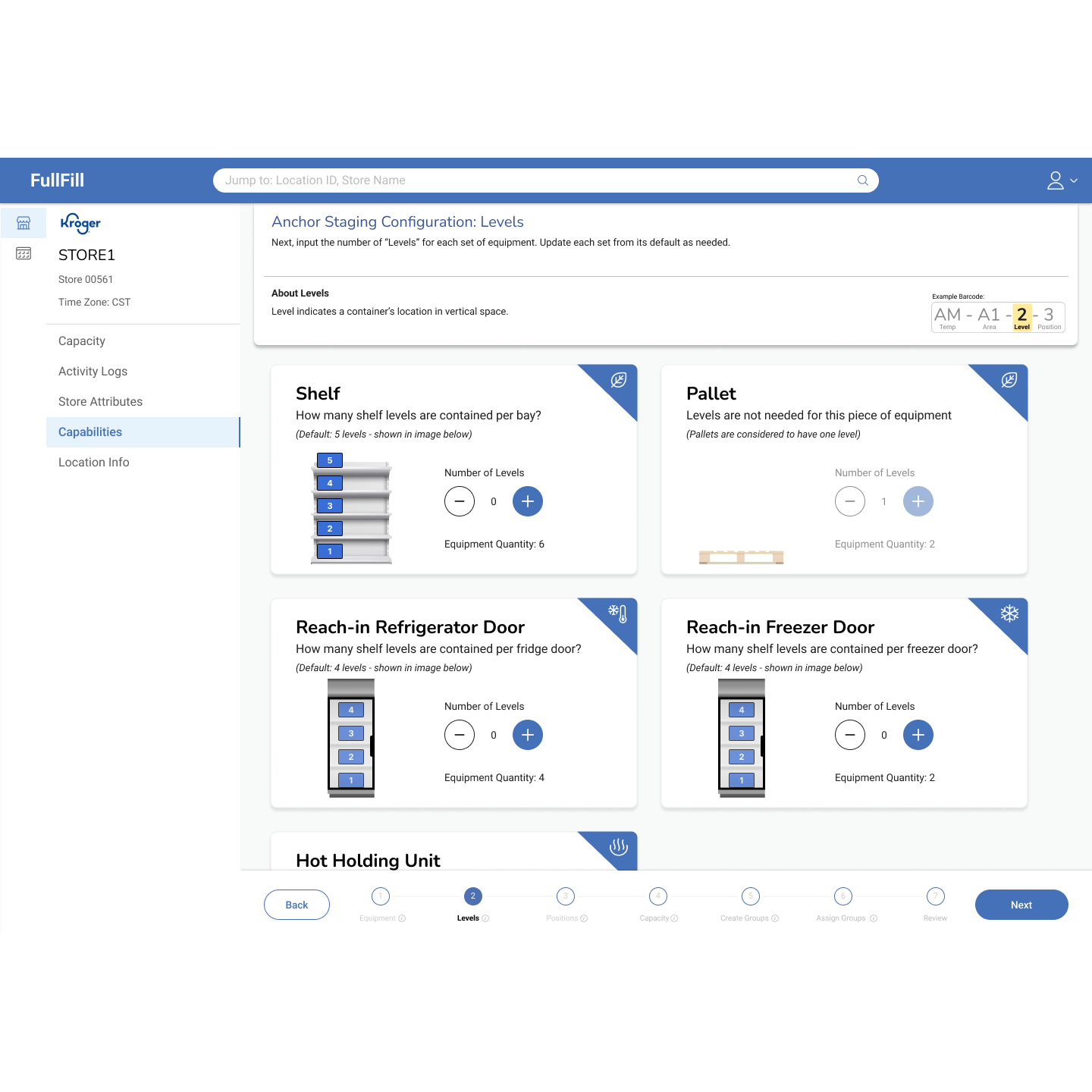
![Step 2: Define Levels]()
Step 2: Define Levels
-
![]()
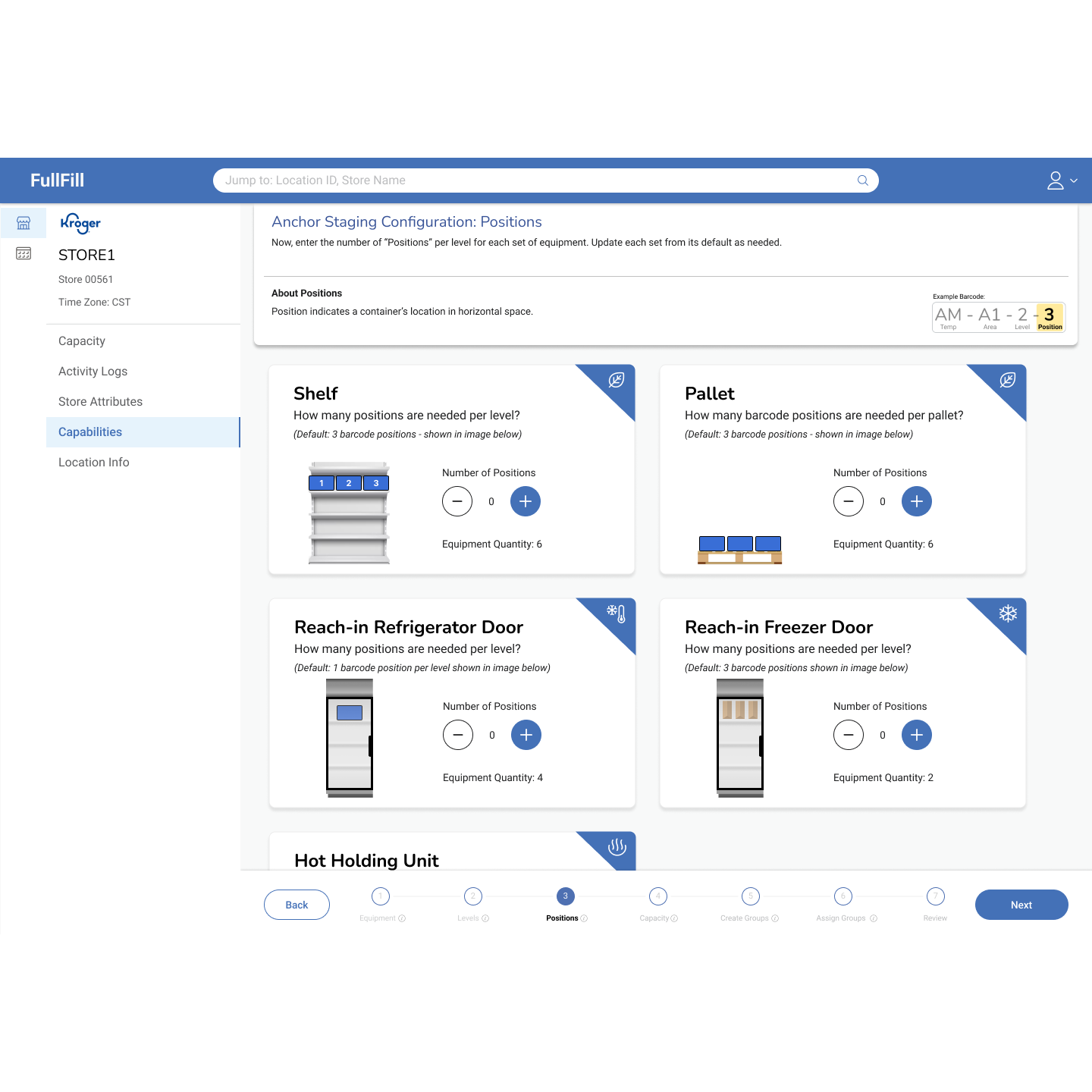
Step 3: Define positions
-
![]()
Step 4: Define capacity
-
![]()
Step 5: Establish Groups
-
![Print Barcodes]()
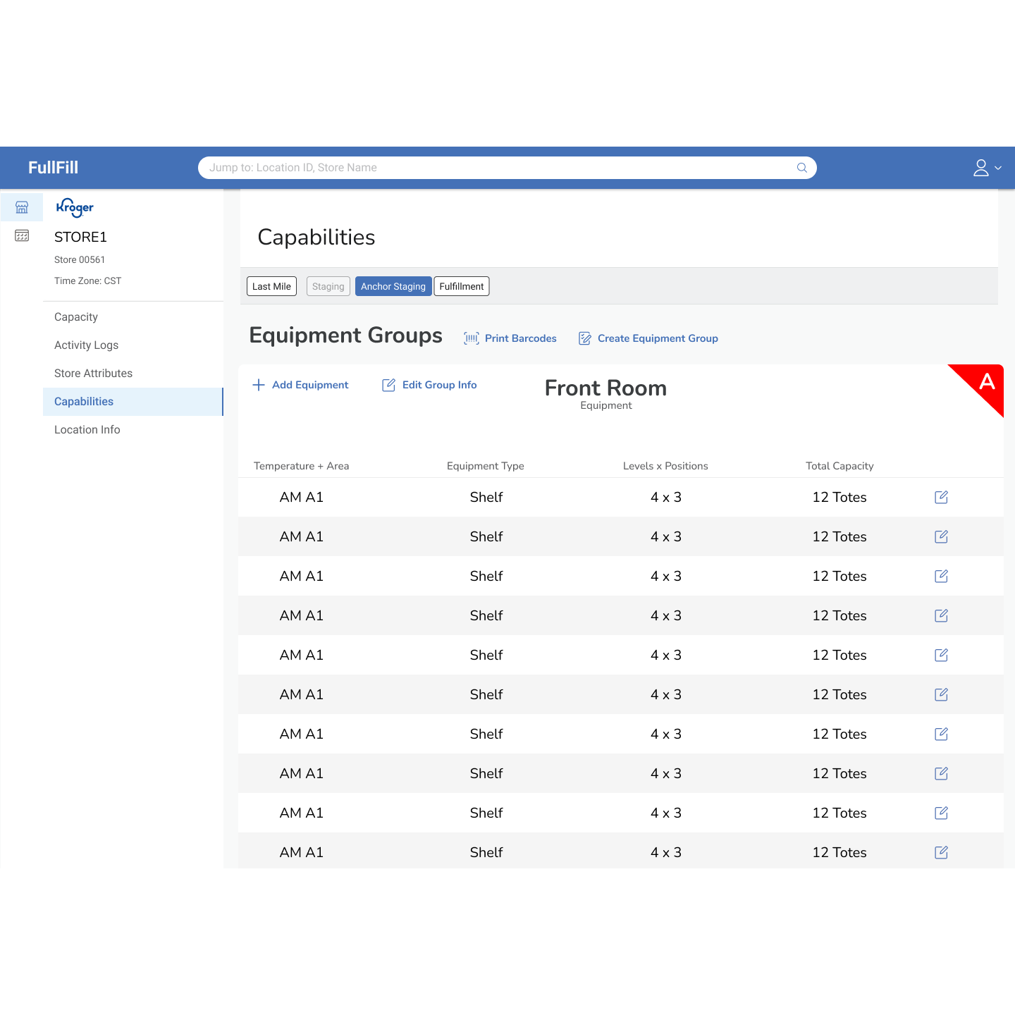
Step 6: Assign equipment to groups
-
![]()
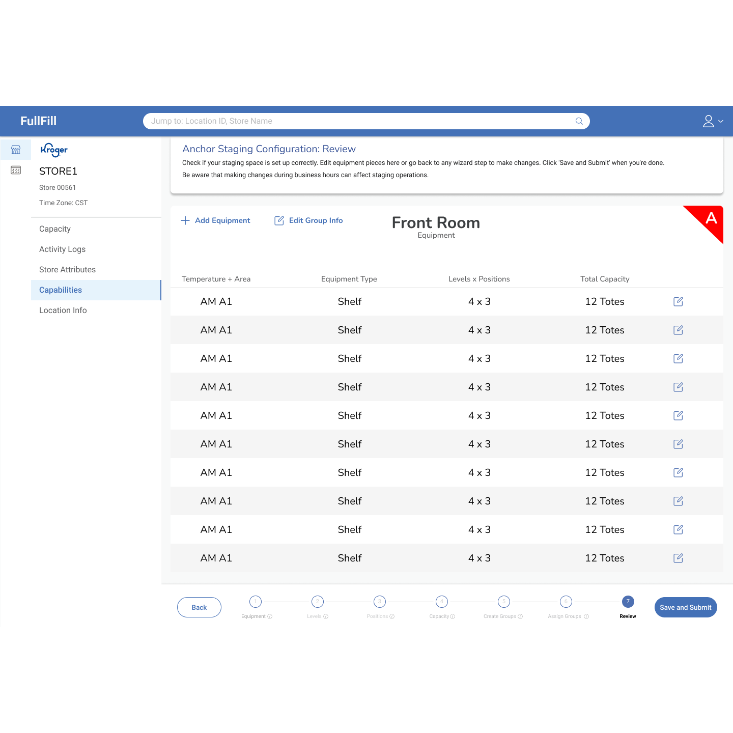
Step 7: Review configuration
-
![]()
Post-save dashboard view