Associate Gamification
Turning daily tasks into meaningful wins for every associate
Role: Product Designer
Scope: Research, user story mapping, UI design, usability study, developer handoff
Timeline: 6 week project 2025
Team: PM, FE/BE engineers, eCommerce stakeholders
Tools: Figma, Mural
Opportunity:
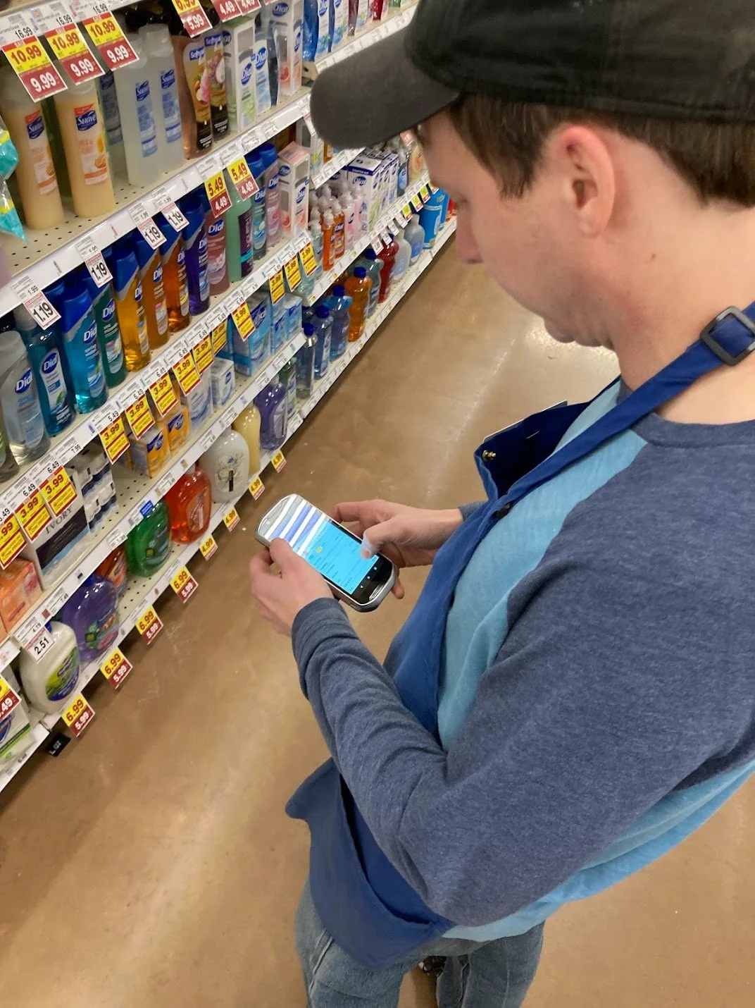
Large retail operations run on thousands of small decisions made by associates every hour. When those decisions follow best practices, stores move faster, orders stay accurate, and associates feel more in control of their work. Leadership had been exploring gamification as a way to reinforce those behaviors and make daily tasks feel more engaging. The idea was to create a lightweight, motivating layer on top of existing workflows that helped associates understand how they were performing and feel recognized for doing things well.
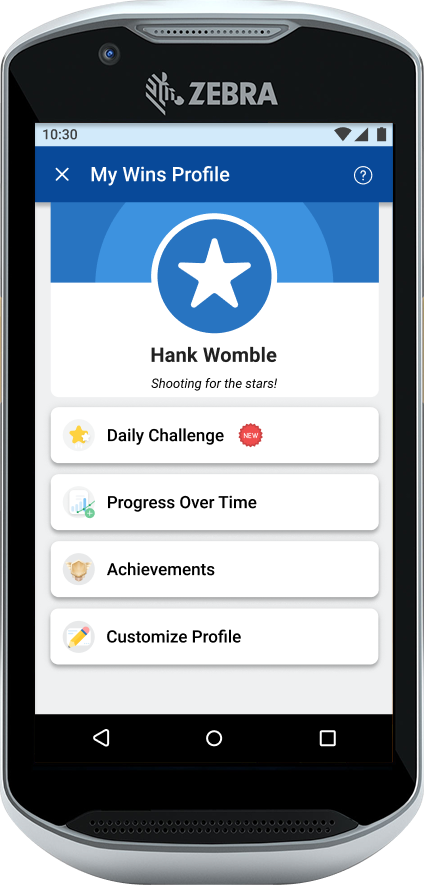
For this case study, I reimagined how we could have approached the project if we had been able to run it end to end with a clear mandate and consistent runway. The goal was straightforward: use the TC52 handheld device to deliver an experience that makes progress visible, celebrates good work, and gently nudges teams toward consistent best practices.
How might we build an associate gamification app on the TC52 that boosts clarity, strengthens habits, and makes the workday feel just a little more rewarding?
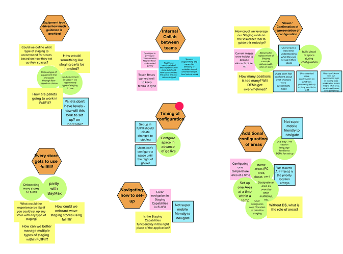
Affinity mapping of stickies into groups
User story map of needed functionality
Findings:
Of surveyed associates:
99% said this
99% said this
Business said:
What this meant for design:
Maintain the logic and terminology of the legacy tool
Focus on a clear, consolidated configuration view with feedback and summaries
Keep the design focused on replacing lost functionality, but save “nice to have” features for the system overhaul.
Discovery:
Associate survey - motivations, thoughts about gamification
Technical discovery - What data is available?
Business priority & data analysis - Which metrics are struggling or is the business pushing, and what processes are tied to them?
Retro of previous staging portal iteration
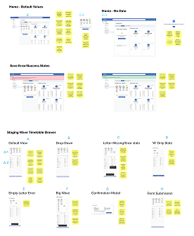
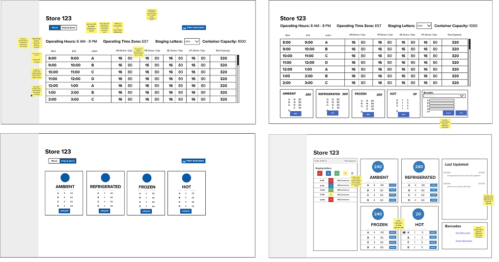
Wireframes -> Medium Fidelity Mockups
We assembled selected components into a unified dashboard layout, prioritizing clarity and dev simplicity. We ran iterative reviews with business stakeholders to ensure alignment on workflow logic, required functionality, and overall user experience.
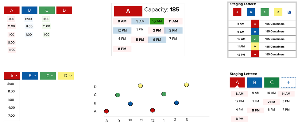
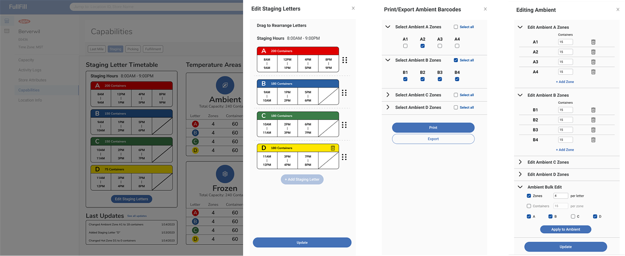
Hi-Fi Mockup - Key Features:
Full parity with deprecated portal to restore all lost capabilities
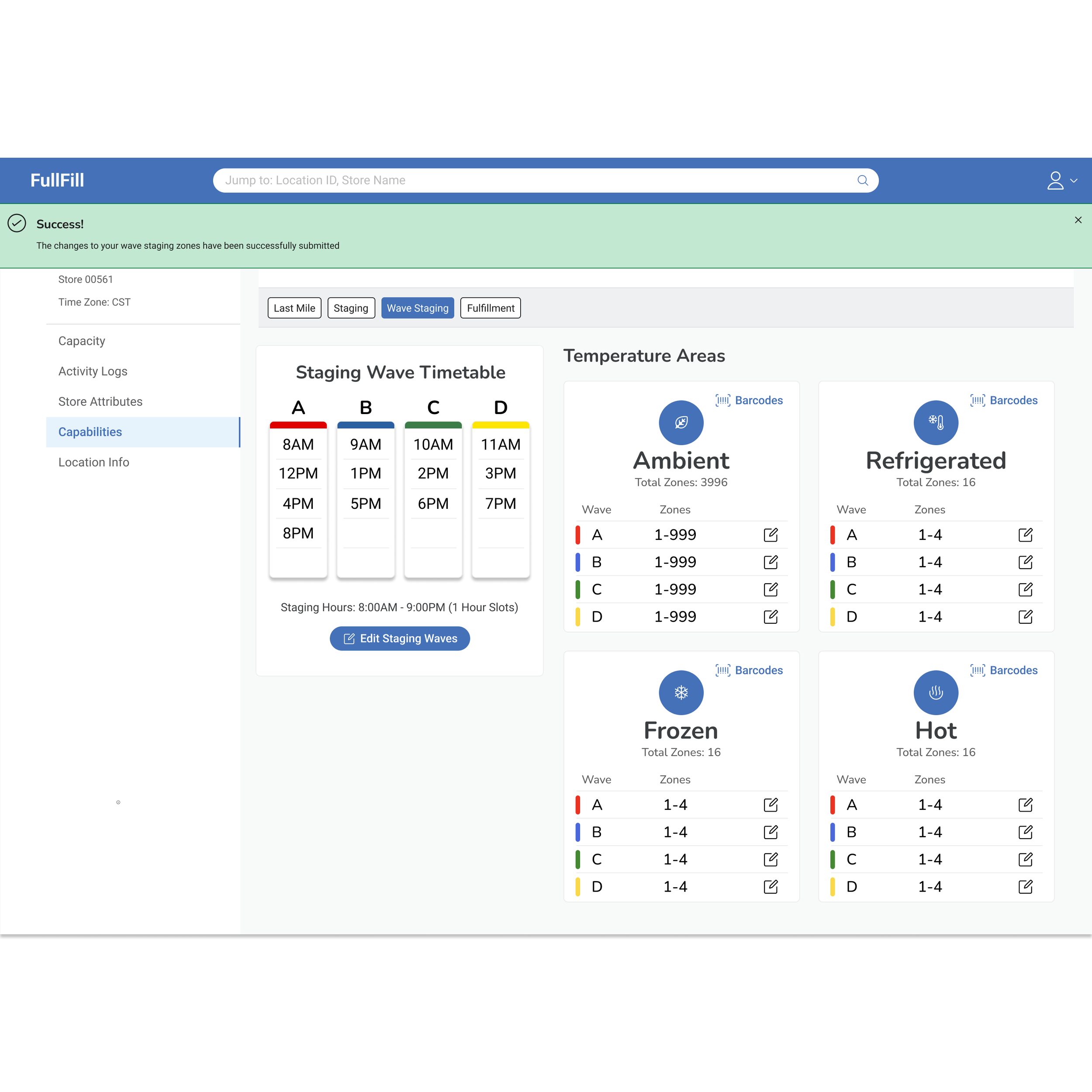
Consolidated clarity through a dashboard-type experience with color/ letter system and drawer-style modals
Development-friendly implementation using Kroger Design System components to reduce build time
Design
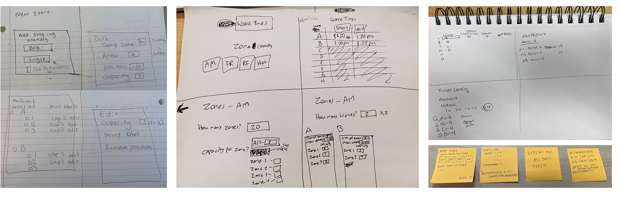
Paper to Digital Sketching
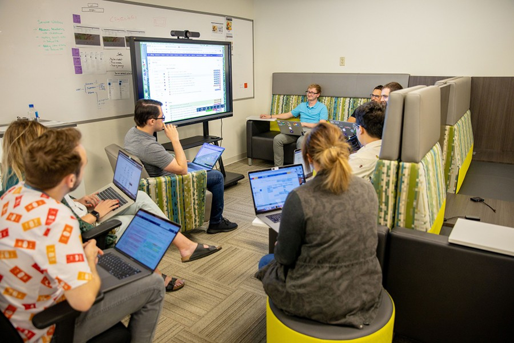
We began with a collaberative "Crazy 8s" exercise to explore layout ideas. We synthesized the strongest patterns and translated them into low-fidelity Figma mockups of possible portal components.
Dev Handoff
Design assets were broken into clear user stories, mapped into a dependency tree, and translated into Jira tickets to guide development. This ensured accuracy, consistency, and a smooth engineering handoff.
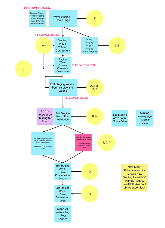
organized into a dependency tree…

and converted into Jira tickets to guide development.
Release to Enterprise
Wave Staging launched on 3/15/23 across:
1000+ grocery stores
75+ district eCommerce managers
Retro:
Wave Staging was one of my first projects at Kroger, and it pushed me to quickly understand complex staging logiv and processes. With the legacy tool gone and limited documentation, we rebuilt the workflow through engaging with SME’s and business stakeholders to understand and build for their experience. This, along with learning to work alongside the front-end and back-end developers was my favorite learning experience of this project.
Outcomes:
Provided a clear and consistent configuration experience for DEM users
Saved the staging support team 30+ hours of manual work each week
Served as a stop-gap solution that allowed for the development of the next-generation staging system (Part 2), which enabled more than $1.5 million in projected savings.
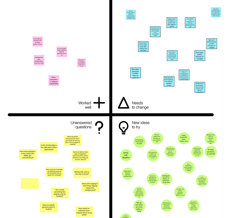
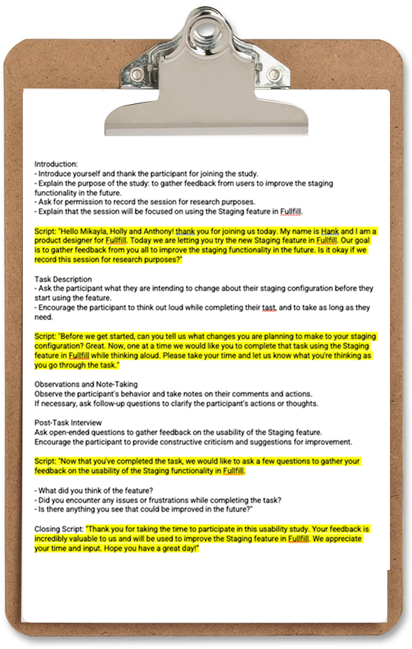
Usability Study
Mocks were broken into user stories in Mural…
We conducted moderated usability sessions with five DEM users. Key outcomes included:
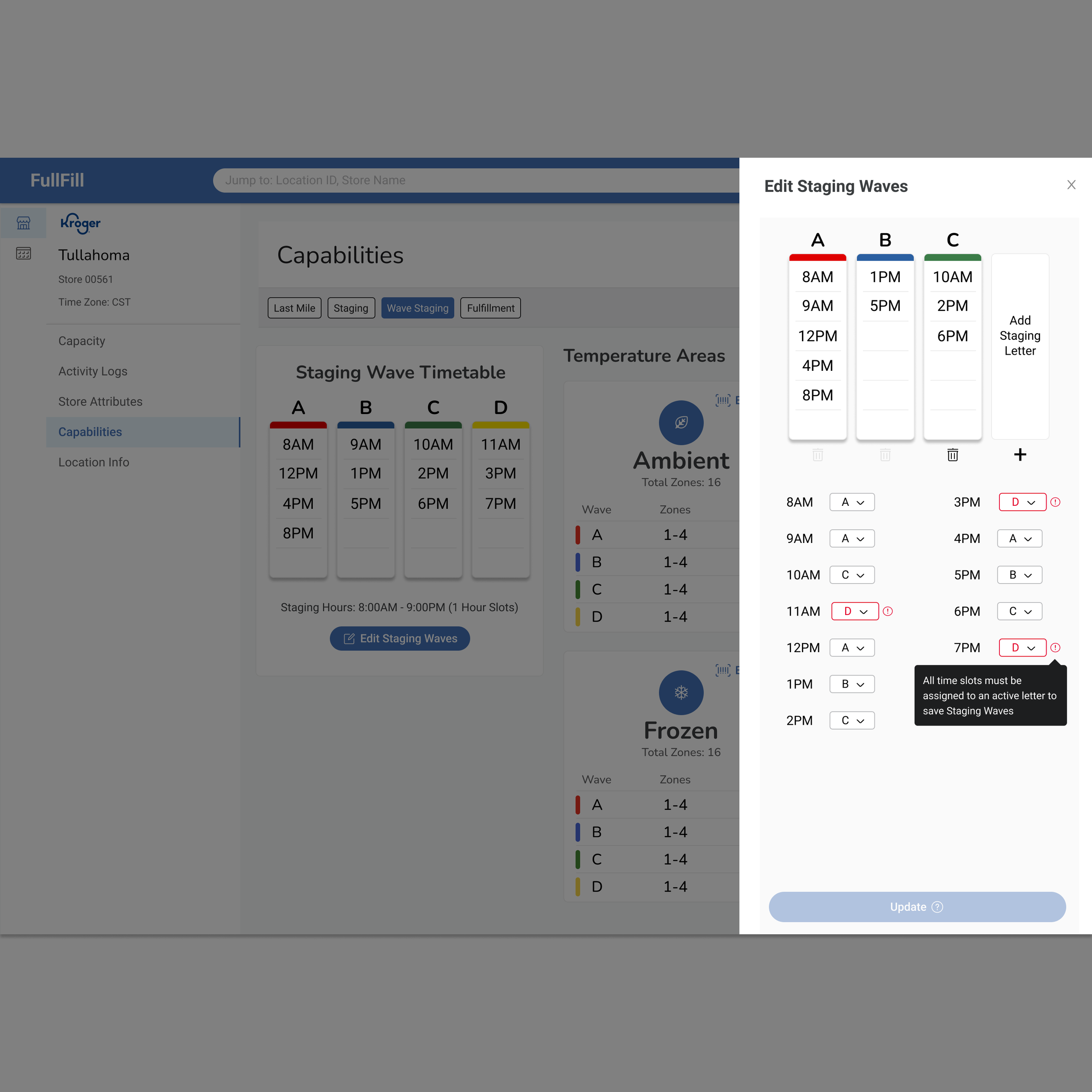
Need for additional guidance, prompting us to add tooltips to the wave timetable form
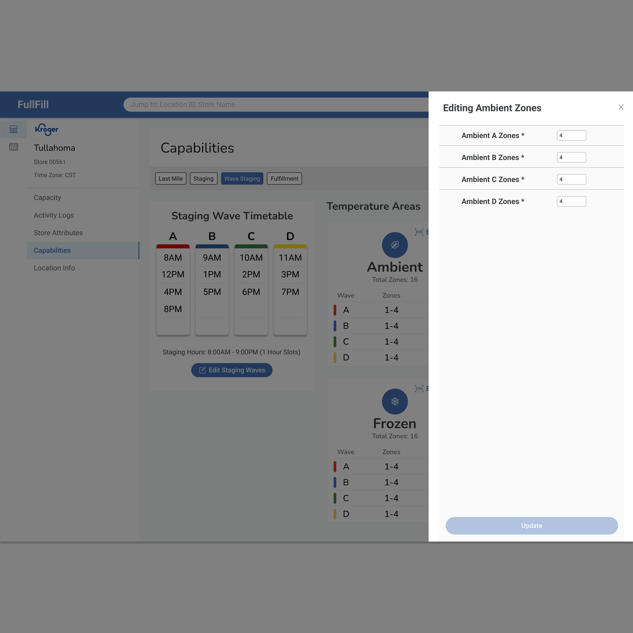
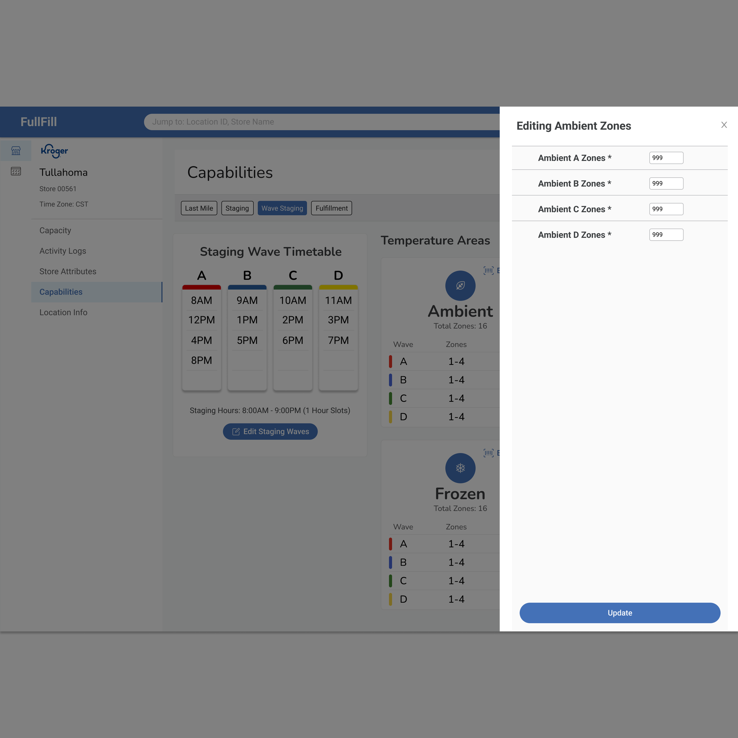
Error prevention improvements, including enforced minimums and maximums on zones
Users reported feeling confident in setting up wave staging after testing
Deferred the "Equipment Capacity" feature to a post-MVP release based on feedback and scope
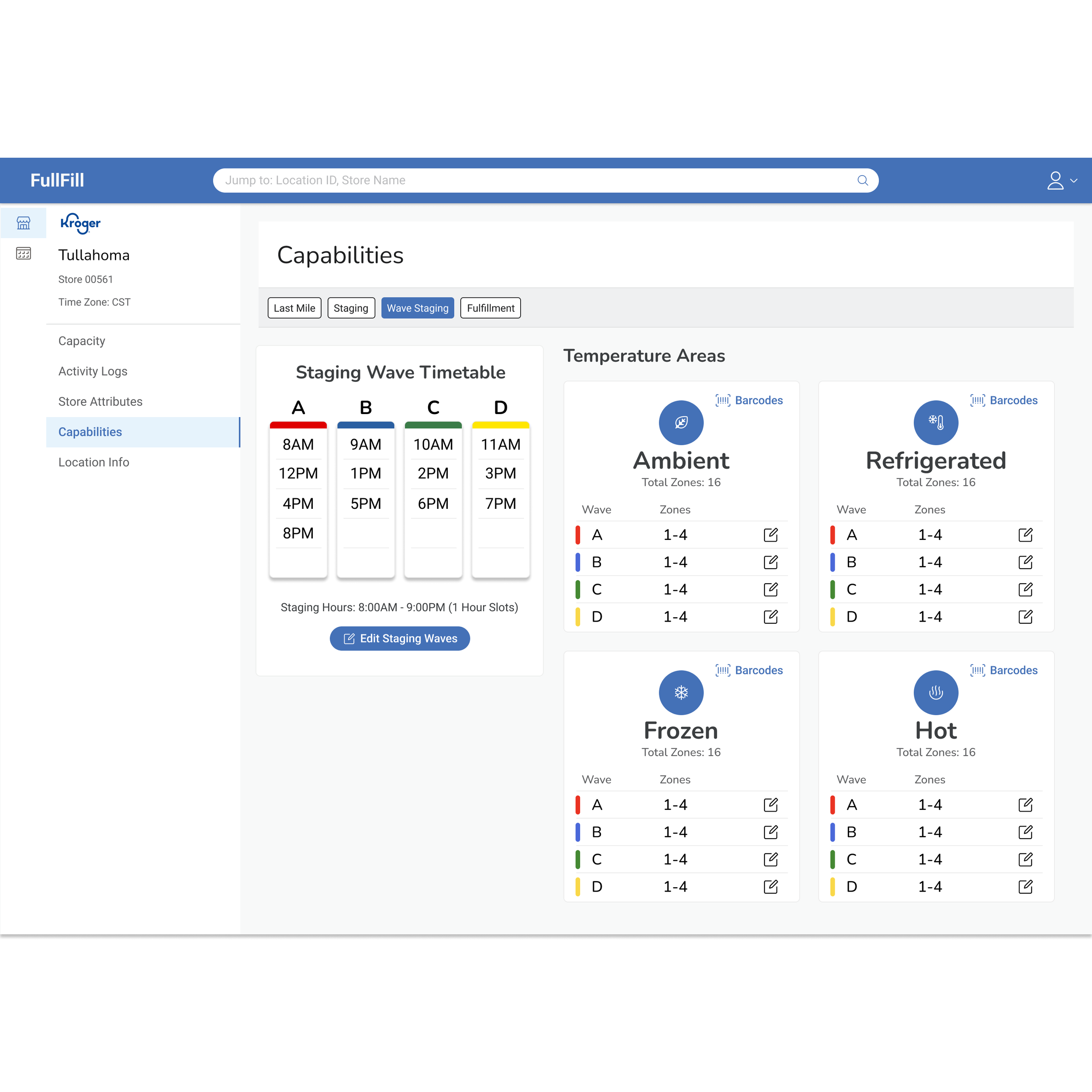
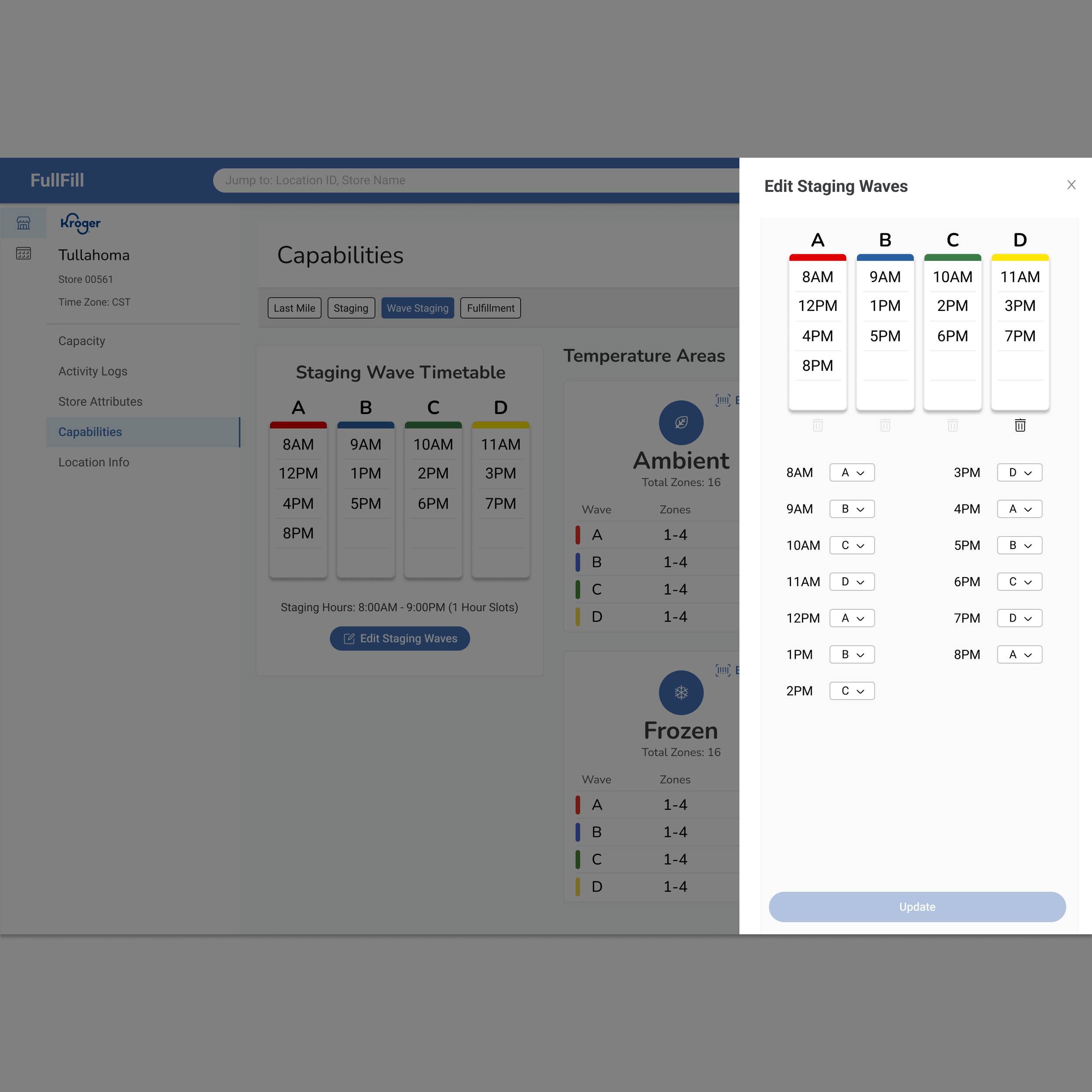
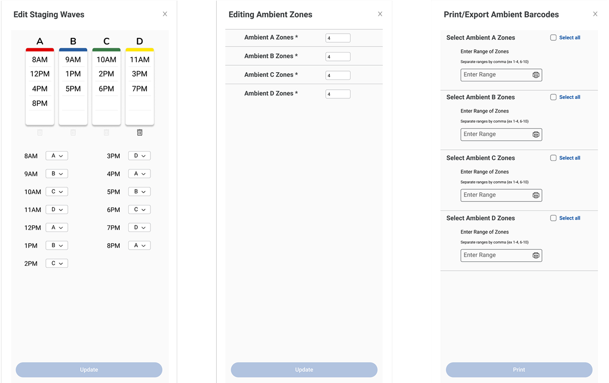
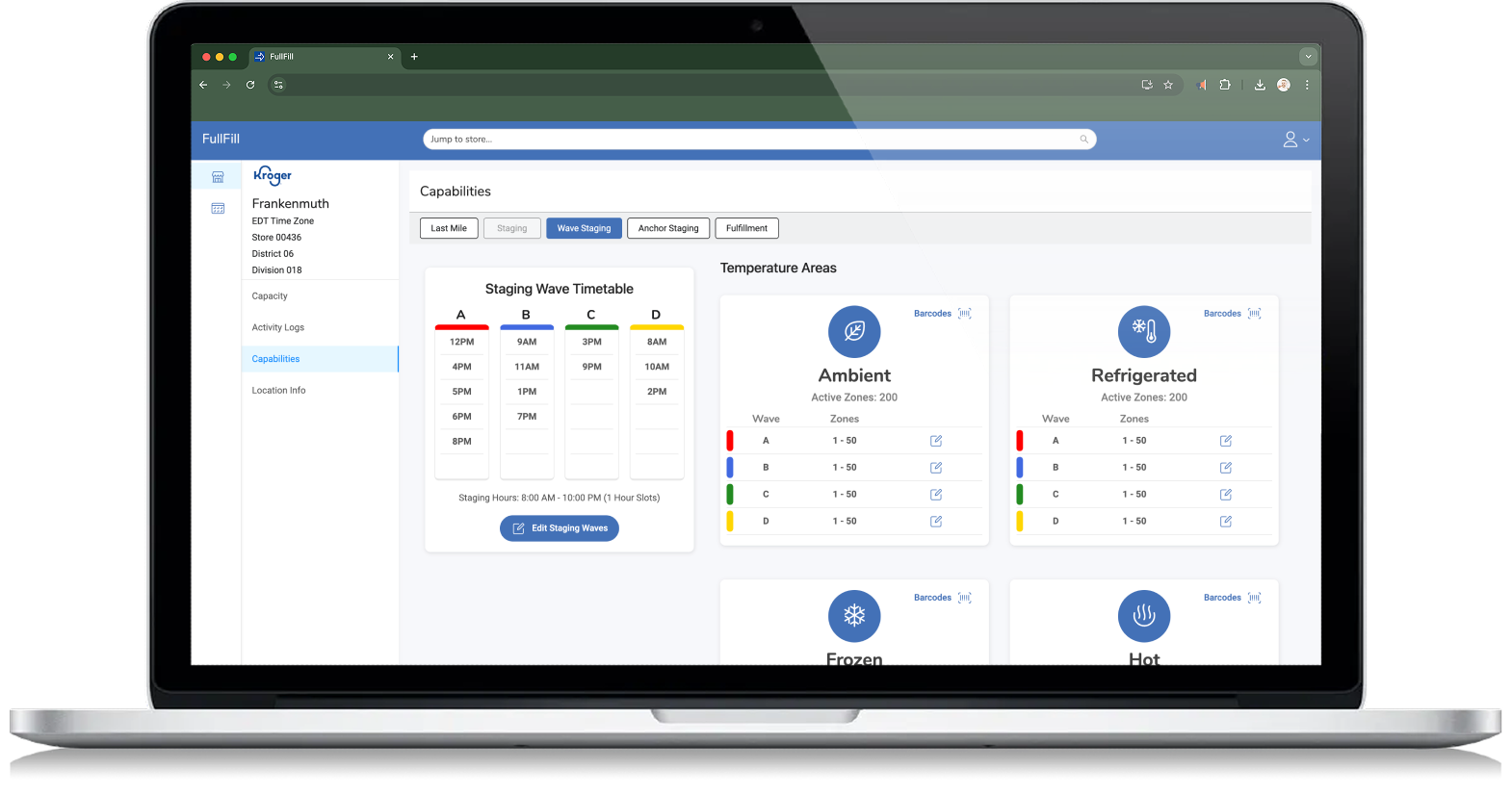
Wave Staging Portal - Gallery
-
![]()
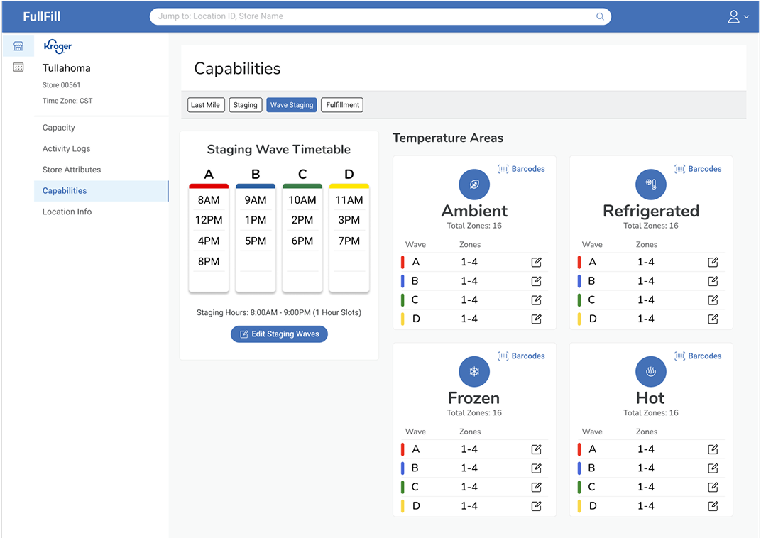
Wave Staging Home
-
![]()
Editing Staging waves
-
![]()
-
![]()
Editing Zones
-
![]()
-
![]()
Configuration Saved
-
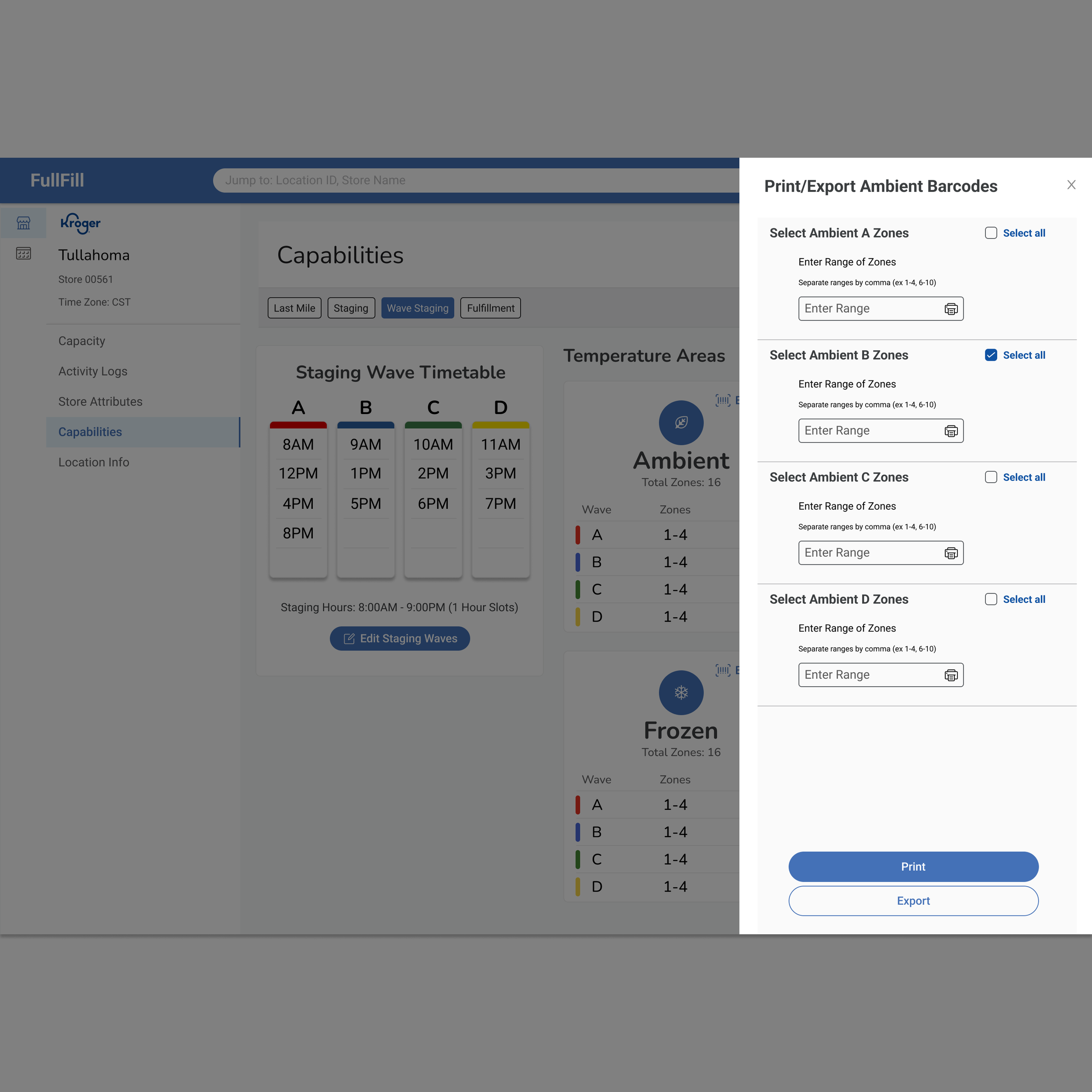
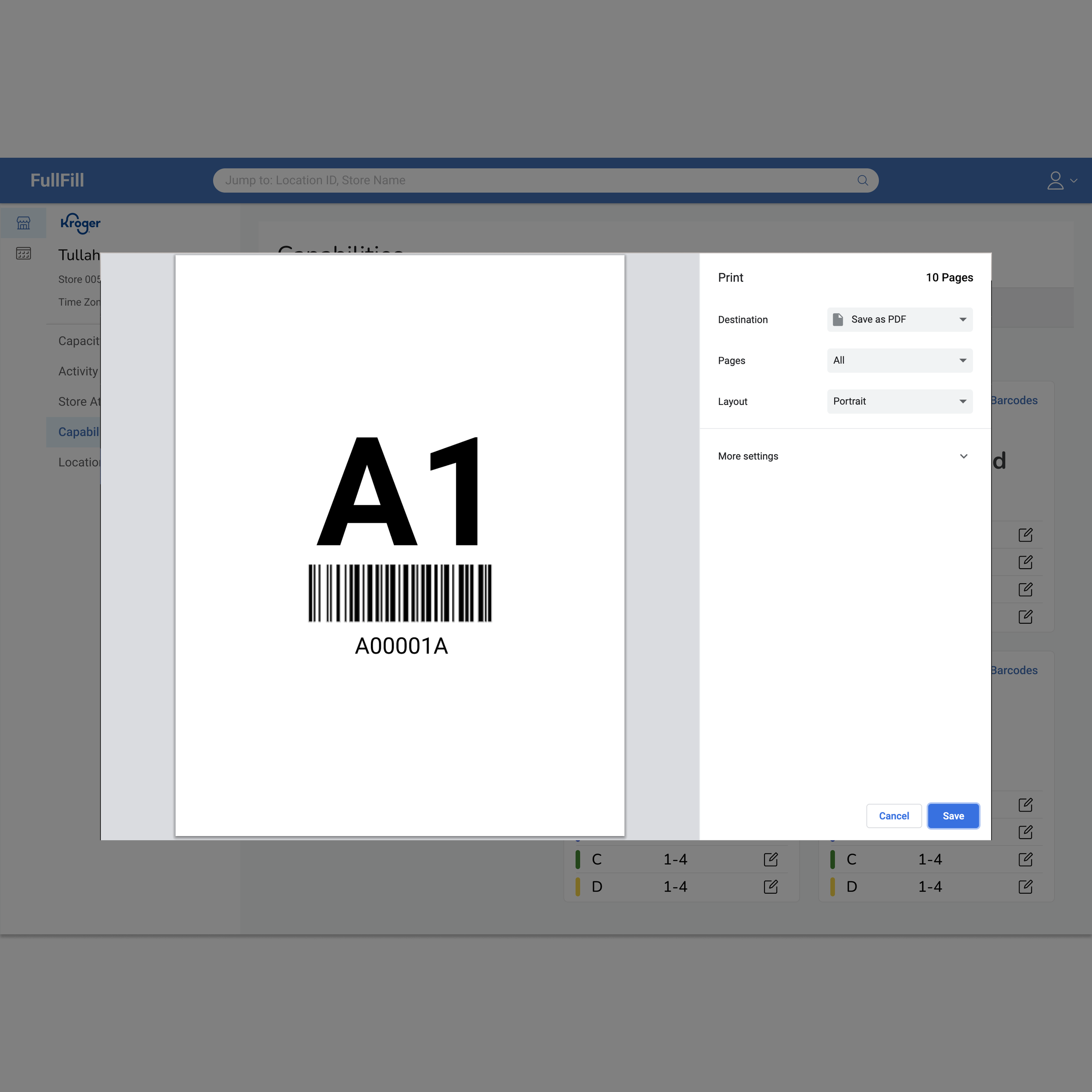
![Print Barcodes]()
Print Barcodes
-
![]()
New List Item